


The analysis of the Portuguese non-governmental organization “Banco Alimentar Contra a Fome” (food bank) visual identity lead to the conclusion that it could use a redesign, in order to better communicate the organization's mission, vision and values.
Categories
Branding
Logo design
Icon design
Client & Year
Banco Alimentar
Project at ELISAVA
Barcelona 2014
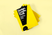
Deliverables
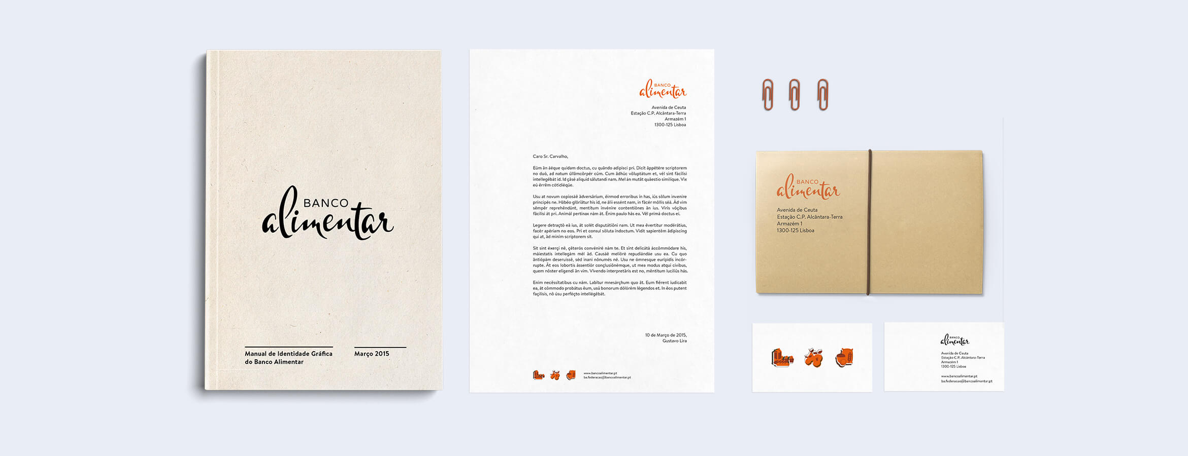
Graphic identity manual
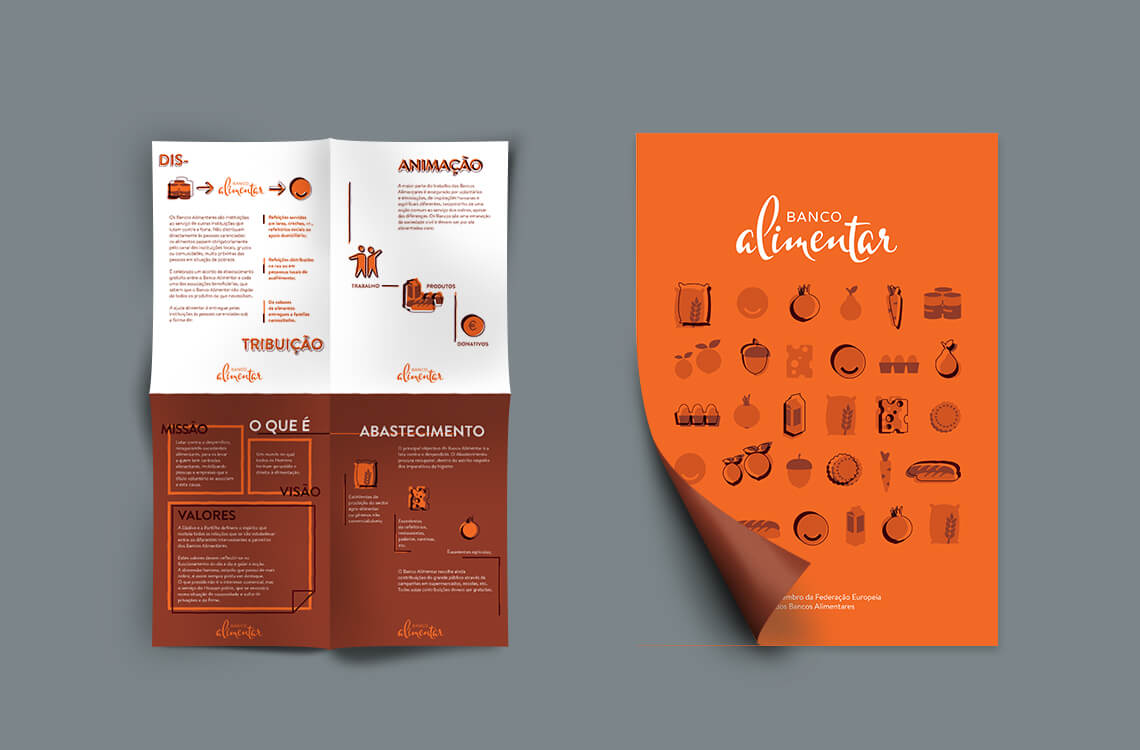
Brochure with info about the ONG
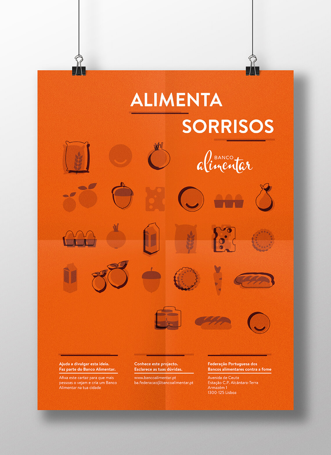
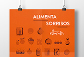
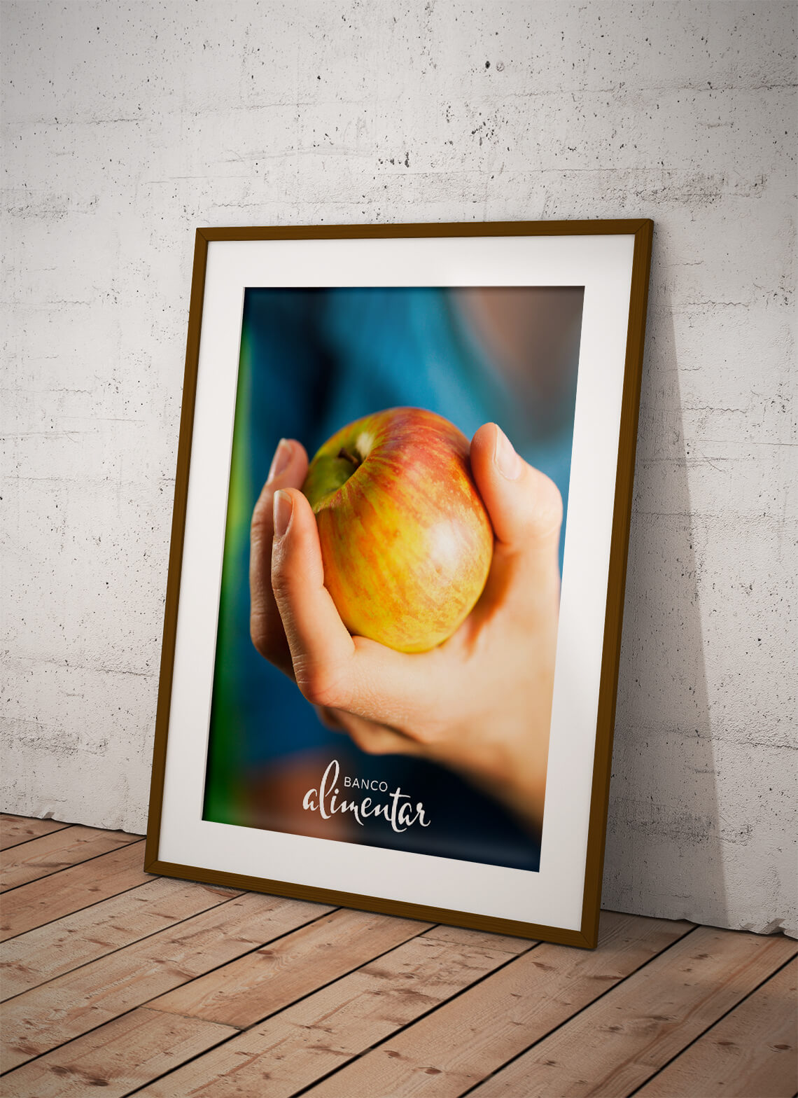
Poster advertising the rebrand
Old vs. New
I decided to rebrand “Banco Alimentar” in the first place because I always thought its logo communicates the opposite of its vision and values. From my point of view, the anatomy of such logo reminds me of gender violence and the subordination of women to men. It goes without saying that these values are far from being the ones a food bank stands for. Therefore, this new logo proposal communicates the values of mutual assistance, proactivity and sharing, also appealing to new volunteer work and patronage.
Defining concepts
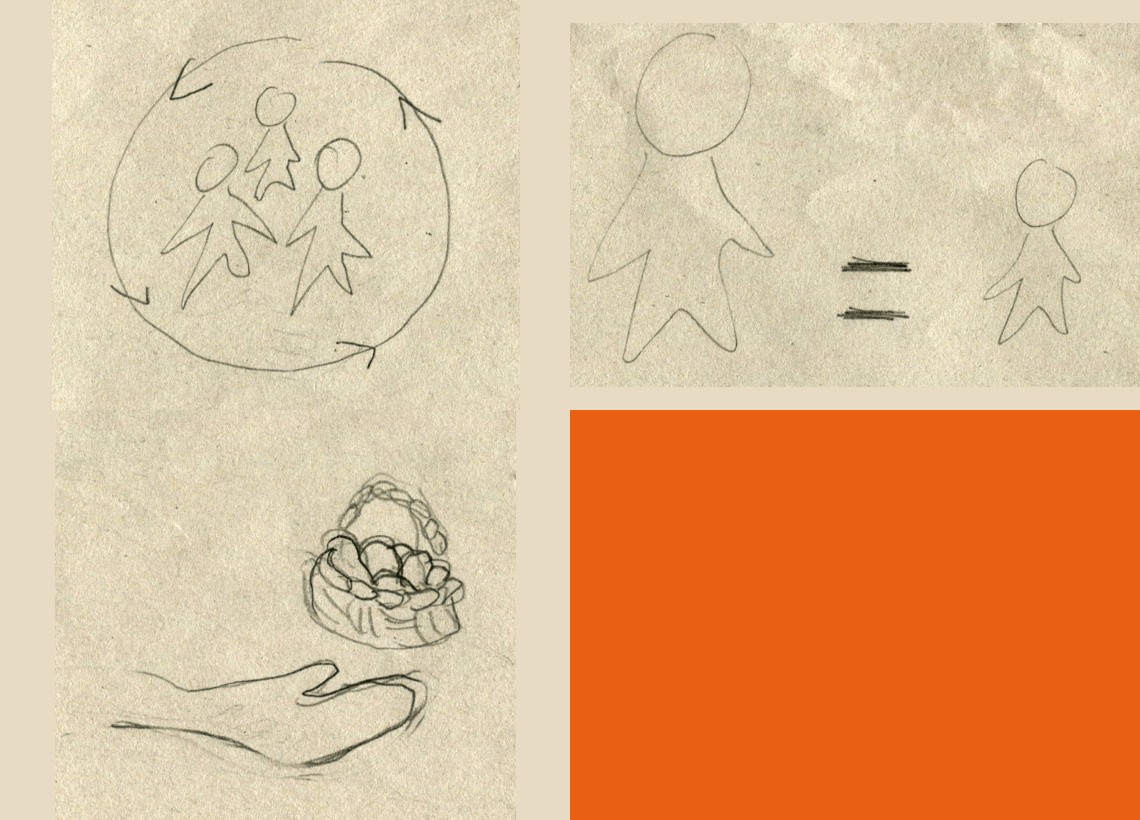
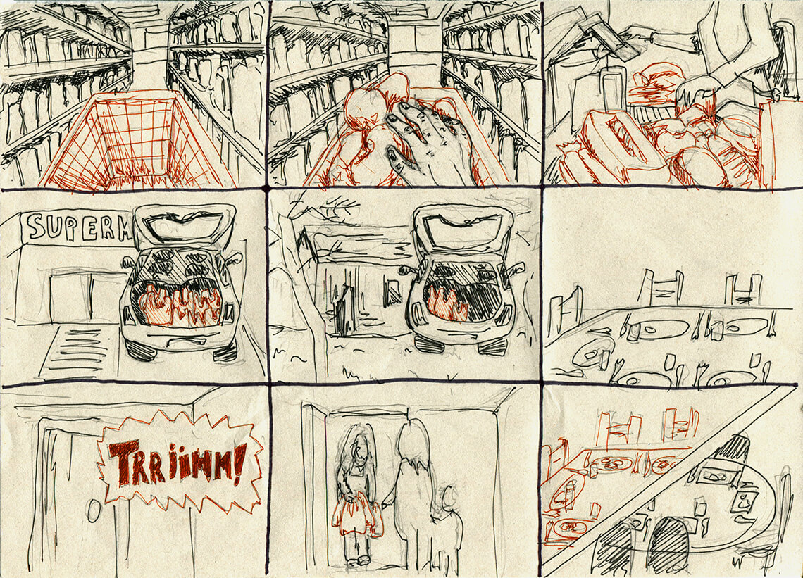
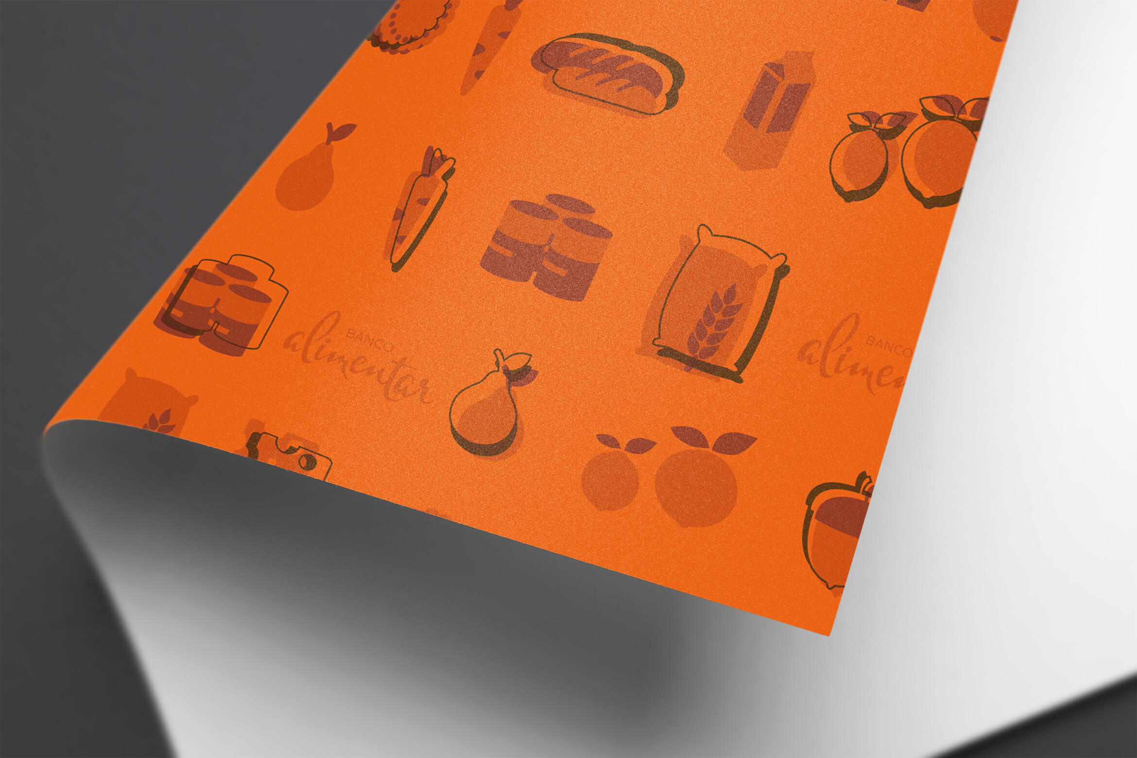
As a first exercise to determine the main visual concepts of Banco Alimentar I sketched the four most relevant values and ideas of the institution, being them Sharing, Equality, Food giving and the colour orange as a friendly and attractive colour, capable of creating a positive vibe. Bearing these concepts in mind I drew a short storyboard illustrating a possible action of the brand.
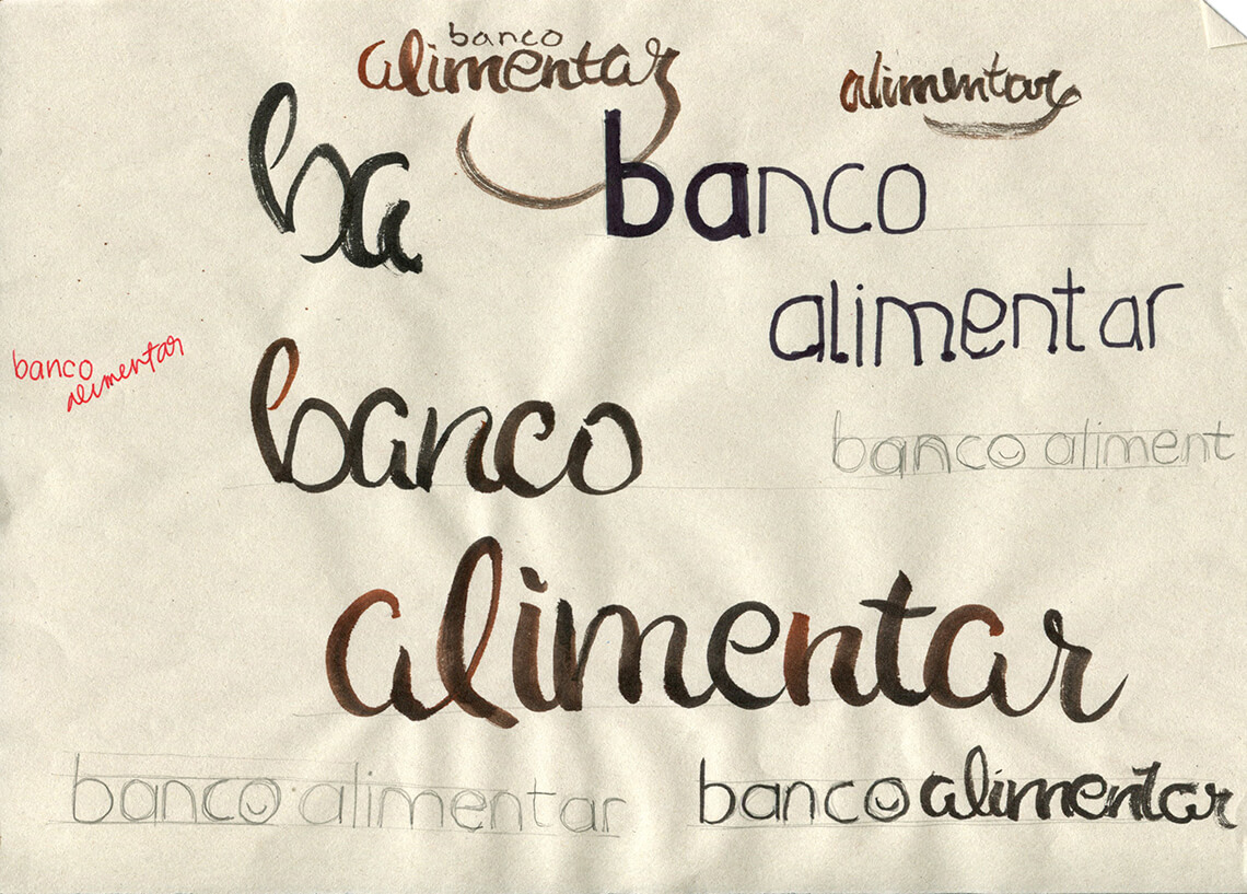
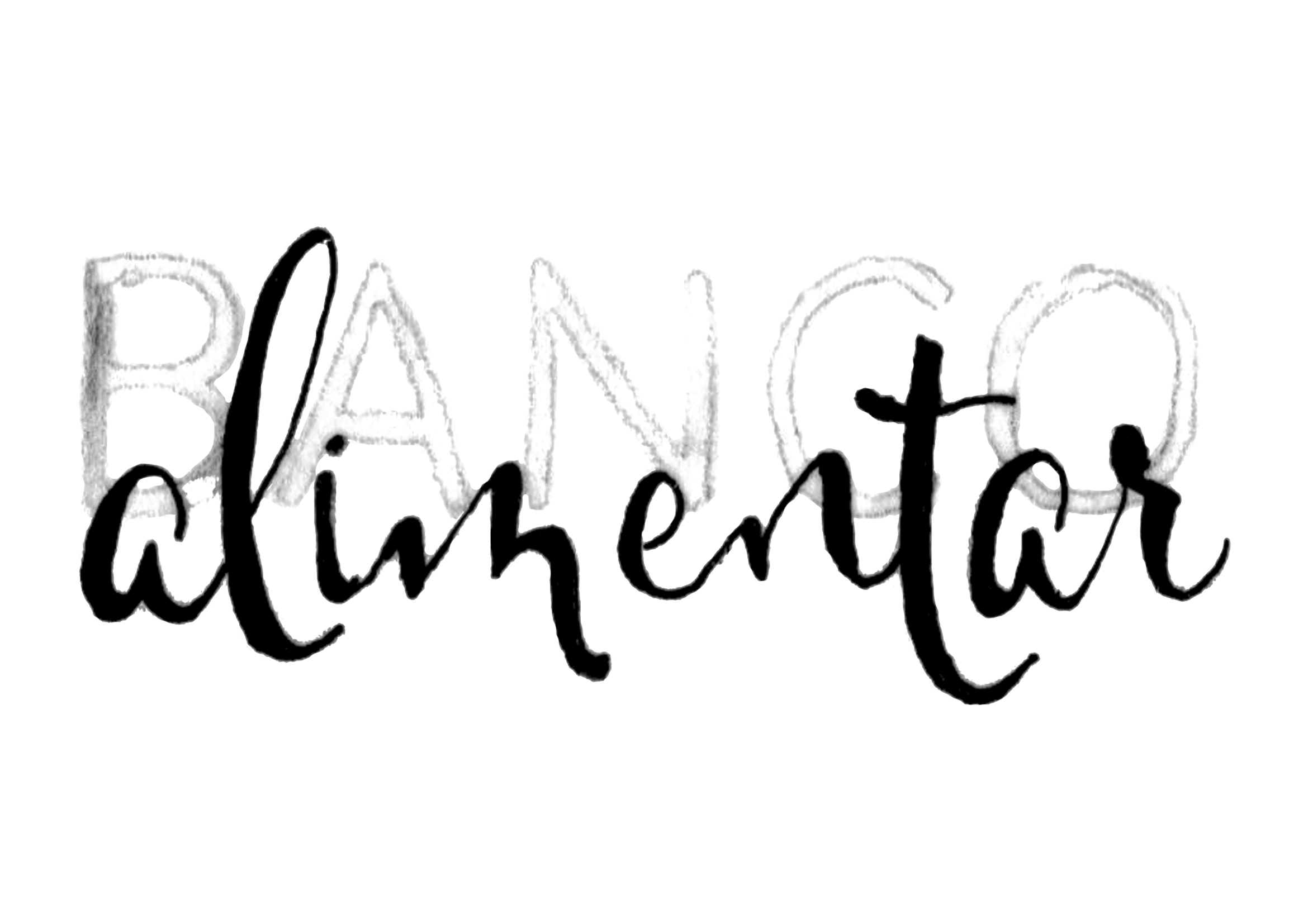
The logo
As Banco Alimentar is already a brand with a good reputation among its public, there is no need for the logo to have an imagotype, since the words “banco alimentar” are enough to identify the company as a whole.
I then started thinking about the typography, working around the word “bank” as something more serious and clean in order to illustrate the importance and reliability of the organization. On the other hand, I thought the word “alimentar” should be calligraphic and organic, resembling humanity, proximity and familiarity.


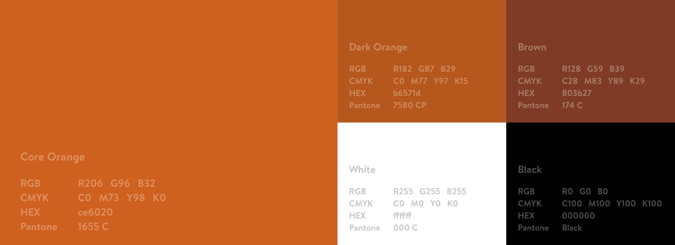
Brand colours
The logo is always used in corporate orange tones, black or white, according to the background. The Banco Alimentar colour palette is made from diversifications of the corporate orange to give the brand a friendly and engaging look.
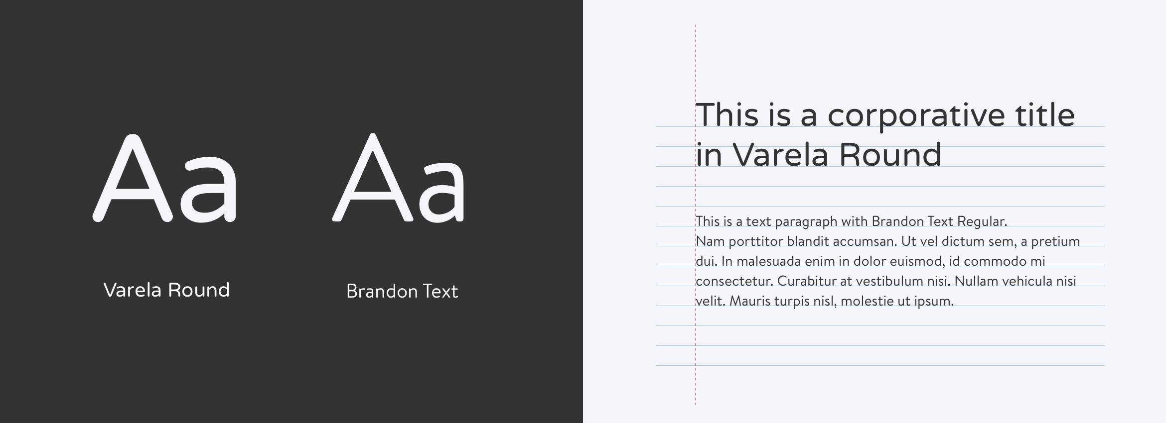
Typography
Just like the brand colours, a consistent and correct use of the corporate fonts, Varela Round and Brandon Text, ensures that Banco Alimentar brand doesn’t lose identity when applied to the most diverse media and materials.
Visual universe
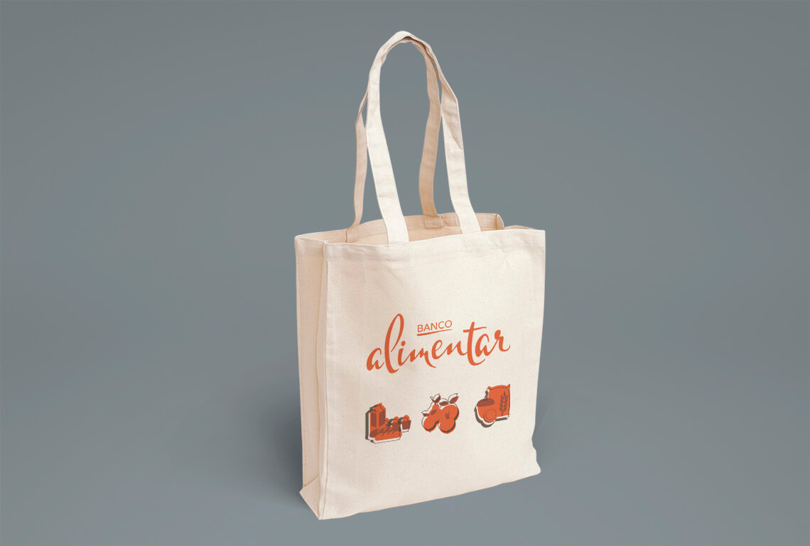
To expand the brand communication materials and ease its recognition across all different media, a series of icons were developed which represent the products dispensed by the organization.

Stationary
As an ONG, Banco Alimentar needs to have cost efficient stationary, using recycled paper and a maximum of two colours on the business card, letter template and envelope. A brand identity manual was also developed to help the organization efficiently implement the new brand.